![]()
HOME ABOUT WORK CONTACT
![]()
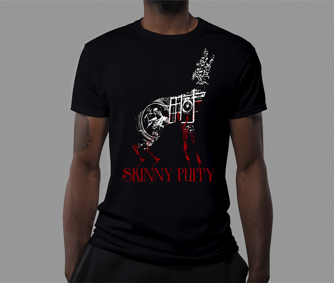
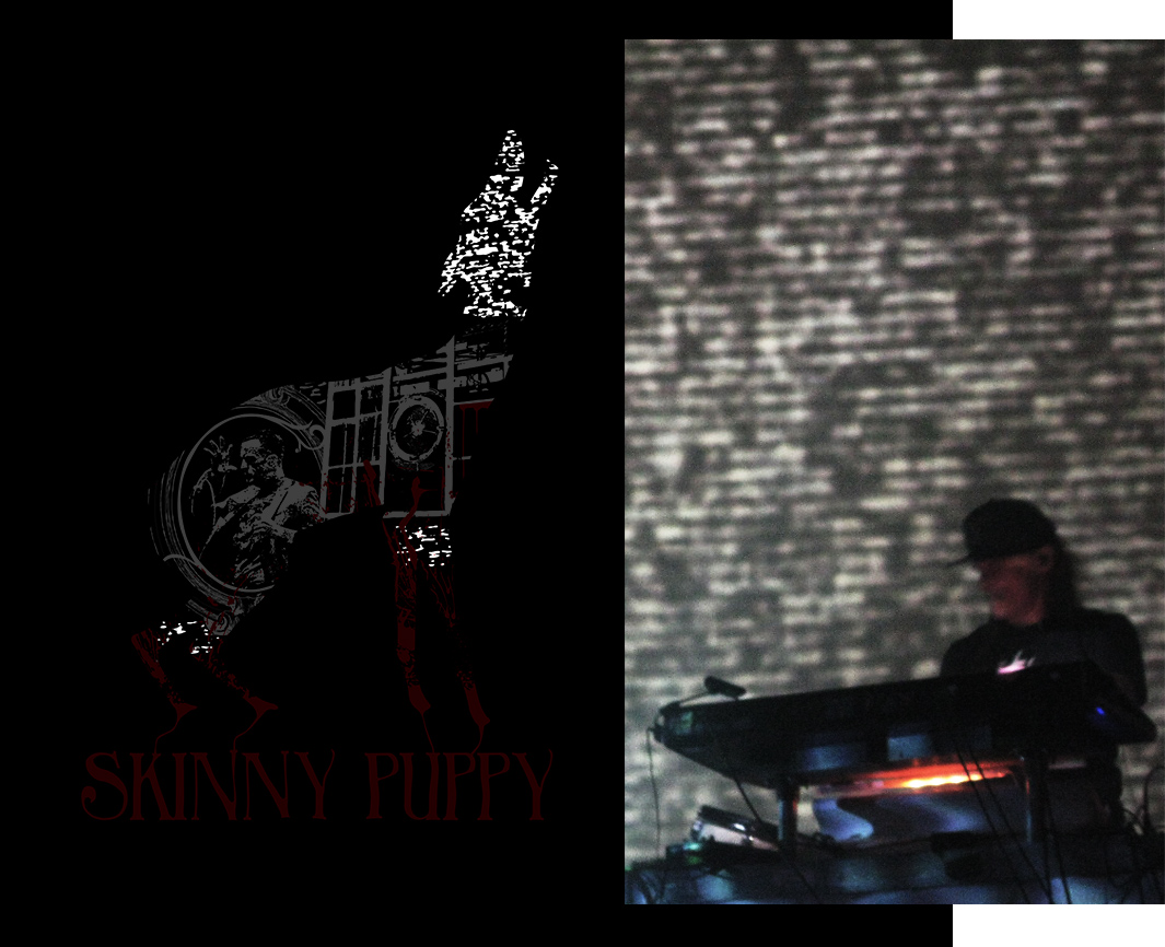
Skinny Puppy Shirt Design
Shirt design for the band Skinny Puppy, an experimental industrial rock band. A fan contest was held and my design was chosen by the band as one of the top three finalists. The design approach was from my unique fan perspective, using elements consistent in their live performances such as the blood and dog prop, and imagery from photographs I took of the many shows I have attended over the years.

The design paired with a typeface I distorted that evokes the horror style theme that goes well with the band, as well as being connected to the dog used in live shows, giving an effect of bleeding into the type.
![]()
“Reading about the process specifically taking into account the images come from live pictures she took at various shows really sealed the deal for me. Great contest and great designs chosen I just felt like this one really captured the melding of fan and artist into one design.”
![]()
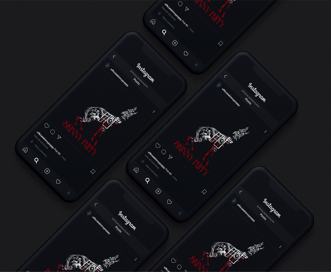
The design was featured on the official Skinny Puppy instagram, with over 59k followers. Some selected fan comments are featured above and below.
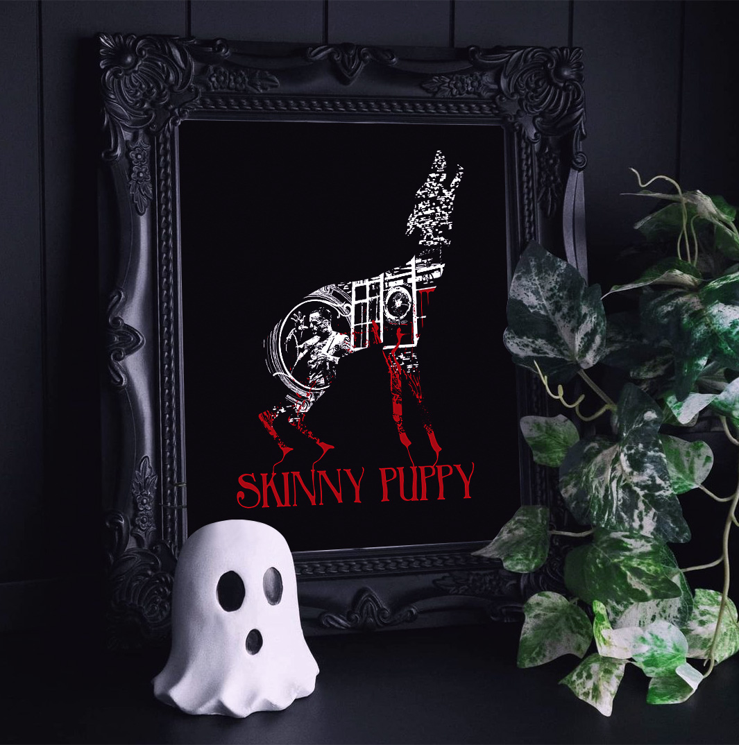
The design also working in a printed framed format. Original photo by @projectthirteen
![]()
“The use of red is thought provoking, though I had no initial thought just a reaction of, “Wow!”. I don’t think it would be the same without the legs that way. I really like the collage of images too. It tells a story.”
![]()
 Original photo by @projectthirteen
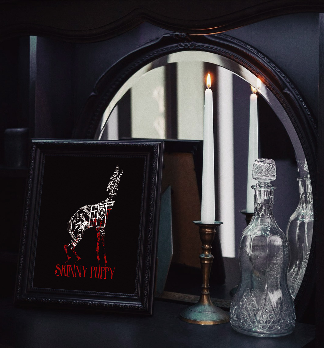
![]()
BREAKDOWN
![]()
Breakdown of the images used in the design, all photos taken by me (excluding the album cover) from the many shows over the years from 2007 until present, showing how every element serves a purpose in the design. I had a lot I wanted to include, and by keeping it within the dog shape allowed for a more contained collage, seeing more details up close and from far a general dog shape.
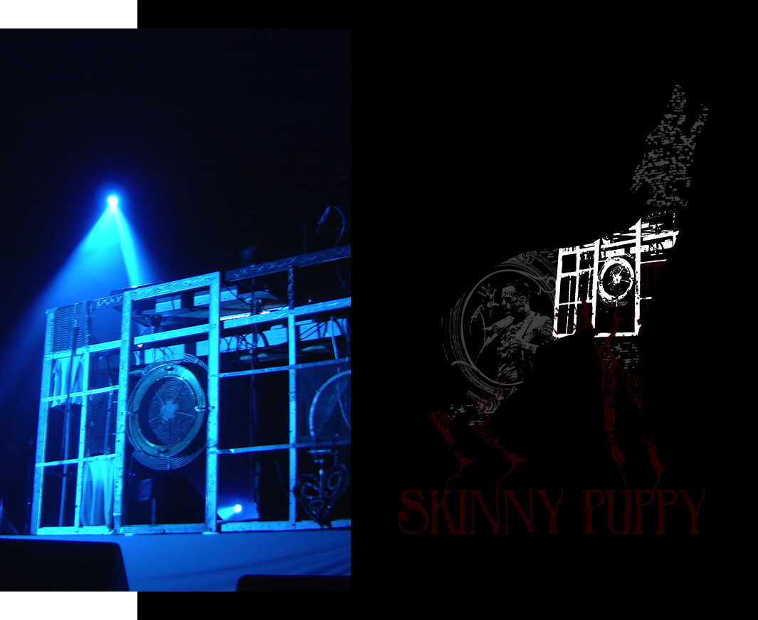
Noise projected imagery used for texture. The space between the elements on the neck of the dog creates a collar-like negative space.
The table used by the keyboard player, which rather than putting his face, is what we see of him live and his piece of the design.
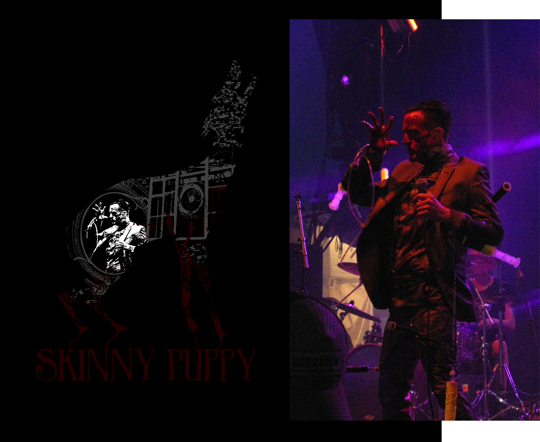
The singer is the face of the band and the main performance and visual of the band, a large part of live shows.
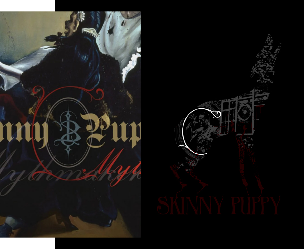
The frame used is derived from one of their album covers, I wanted every element to relate to the band in some way.
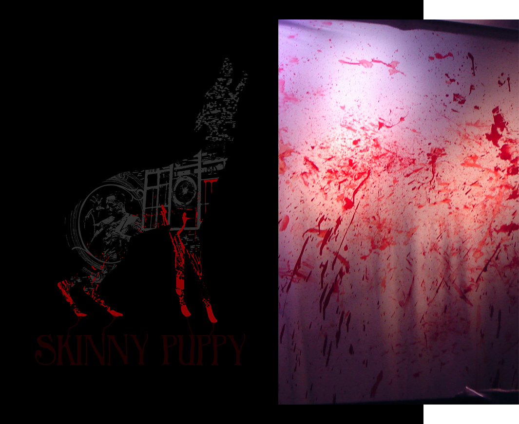
Bloody curtain consistent at every single show since the band’s inception. I had to include blood, since it’s such a big part of their live performances.
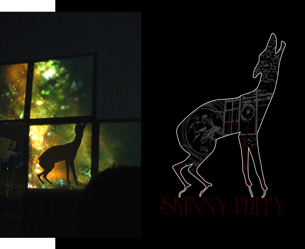
Dog shape derived from the prop used in live shows. The thin wires under the paws were used to attach to the band name, giving a bleeding into effect, and a platform for the dog to sit on. I added an ear to make the shape as clear as possible.
![]()